
TL;DR
- AI websites look the same because models output the statistical average of their training data. A 2024 study in Nature documented "model collapse": output converges to the mean and away from anything distinctive.
- The default tells are consistent: the Inter typeface, an indigo-500 (#6366F1) purple-to-blue gradient, a centered hero with a badge above the H1, and exactly three shadcn/ui feature cards in a grid.
- The generic look signals "AI-generated" in under 3 seconds, and in 2026 that signal actively lowers trust. Over 40% of AI-generated code contains design flaws.
- The real cause is not a broken model. It is unmade decisions: the AI is asked to make a page before it is given the choices that would make that page specific.
- The fix: make 5 decisions before you prompt (reference, color, typeface, layout, exclusions), not after you see the result.
👉 Skip the guesswork on what to decide before you build: MoreMagpie helps non-technical founders surface the choices they didn't know to make, join the waitlist.
Your AI Builder Isn't Broken. Your Brief Probably Is.
You described an idea. The AI built a site in 20 minutes. It looked great.
Then someone said: "This looks like every other AI site."
Here's the uncomfortable part. They were right. Same gradient. Same font. Same centered hero.
Most people assume the model is just generic. It isn't. The model has far more range than it ever shows you. The problem is that you asked it to build before you told it what to build.
Here's what we'll cover:
- what "averaging" actually means
- the exact tells to spot
- why it costs you trust
- the decisions that change the output
- how to brief against the default
What AI Design Averaging Actually Means
AI aesthetic convergence is the pattern where different AI builders produce near-identical visual output because each one returns the statistical average of its training data, and that average is the least distinctive design available. Ask for a "SaaS landing page," a "portfolio," or an "e-commerce site," and the look converges anyway.
A 2024 study in Nature gave this a name: model collapse. Models trained on generated data lose information about the tails of the distribution and converge to reduced variance. In plain terms, output drifts toward the mean and away from anything distinctive.
And it compounds. As more AI-generated design gets fed back into the training pool, each cycle makes the median more confident and more homogeneous.
This is why Lovable, v0, and Bolt land in the same place. They were trained on the same popular building blocks, mainly shadcn/ui components and Tailwind CSS patterns. So they reach for the same safe defaults no matter what you type.
There is even a dated origin story for the purple. In August 2025, Tailwind's Adam Wathan posted an apology on X that got over 1 million views. He apologized for making every button in Tailwind UI use bg-indigo-500 five years earlier, which, he joked, caused every AI-generated interface on Earth to turn purple.
One default, five years ago, now everywhere.
The Specific Tells That Give It Away
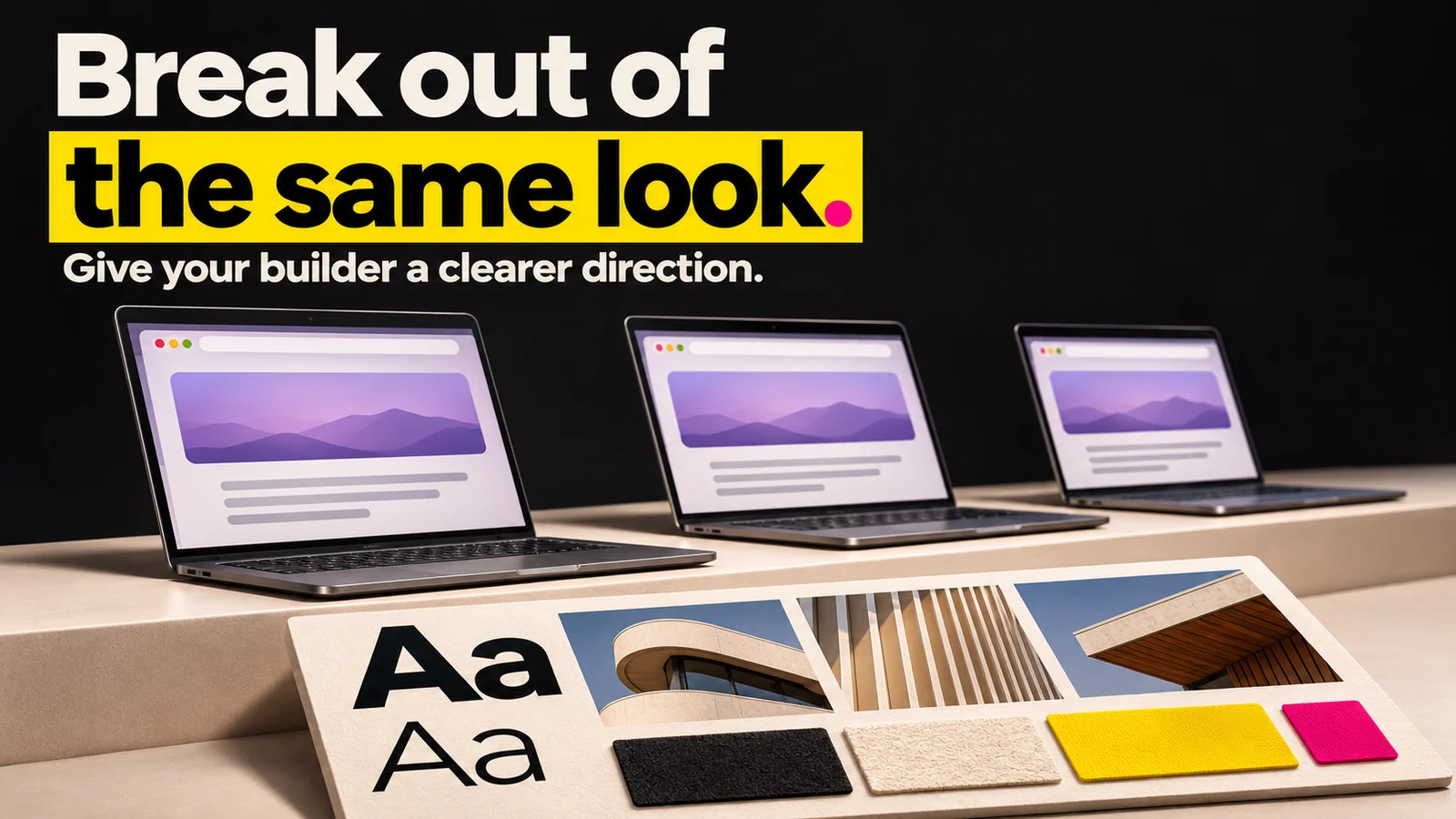
About this illustration
AI-generated editorial illustration. The anonymous templates are illustrative, not measured outputs from named AI builders.
The generic AI look is not random. It is a specific, repeatable set of defaults. Here is the field guide.
| Tell | Why the model defaults to it |
|---|---|
| Purple-to-blue gradient, indigo-500 (#6366F1) | Tailwind's old hero color, baked into training data |
| Inter, Poppins, or Geist headlines | The safest, most-trained typefaces |
| Centered hero with a badge above the H1 | The single most common hero pattern online |
| Exactly three feature cards in a grid | The averaged "right" number of features |
| A "1 . 2 . 3" numbered step row | The default way to show a process |
| Colored 3-4px left-border strip on cards | A shadcn/ui component default |
| Default shadcn-gray and Tailwind-blue | The out-of-the-box palette |
| Reflex dark mode | Increasingly requested by default |
| Neon-on-dark glowing card borders | The trendy default inside dark mode |
The data backs this up. Gradients are the single most-requested visual device in AI design: 61,193 prompts across 21,505 distinct projects. Dark mode requests rose from 26.8% of prompts in January 2026 to 38.1% in May, which means roughly 2 in 5 AI designs are now explicitly asked for in dark.
So when you leave a decision open, the model fills it with the most common answer. The defaults are not a bug. They are the average doing its job.
Why the Generic Look Is a Trust Problem in 2026
The generic look matters because visitors read it as low effort before they read a single word of your copy. The patterns together signal "AI-generated" in under three seconds, and in 2026 that signal actively lowers trust.
It is not only a vibe problem. Over 40% of AI-generated code contains design flaws (Second Talent, 2026). So the same build that looks generic often has real issues underneath.
And it compounds. As more sites ship the same defaults, the signal gets stronger and faster to read. Being generic in 2026 carries a cost it simply did not carry in 2023.
Here is the honest catch. A unique-looking site does not automatically build trust. But a recognizably generic one actively loses it. You are not buying credibility by being different, you are avoiding a penalty for being the same.
The Decisions You Need to Make Before You Prompt
The root cause is not a model gap. It is a decision gap. Many AI sites look the same because the AI is asked to make a page before it is given the choices that would make that page specific.
So make the choices first. Here is the Brief-First Checklist: five decisions to lock before you open any AI builder.
| # | Decision | What to actually say |
|---|---|---|
| 1 | Visual reference | Name a real site whose layout you like, not an adjective |
| 2 | Color constraint | State the hex or palette explicitly, do not leave it open |
| 3 | Typography | Name the typeface, or rule out Inter, Poppins, and Geist |
| 4 | Layout structure | State the hero shape, column count, and section order |
| 5 | Explicit exclusions | Name what NOT to do |
Why each one works:
- Reference over adjective. "Clean and modern" averages to the default. "Lay it out like Stripe's pricing page" gives the model a specific target it cannot average away.
- Color constraint. For example, saying "no purple gradients, use a warm terracotta #C45B3C" removes the single most common default in one line.
- Typography. Naming "Fraunces for headlines" stops the model reaching for Inter by reflex.
- Layout structure. "Left-aligned hero, two columns, no badge" breaks the centered-badge-over-H1 pattern immediately.
- Exclusions. Telling it what to avoid ("no gradient CTA, no three-card grid") is often more powerful than telling it what to want.
Here is the honest catch again. Even a fully specified brief does not guarantee a unique site. It just closes the gap the model exploits when you leave things open. You still need to check the result against the tell list above.
How MoreMagpie Helps You Brief Against the Default
Making those five decisions assumes you know they exist. Most non-technical founders don't, which is exactly the problem.
What it does: MoreMagpie is a companion for non-technical founders and AI builders. It does not replace your AI builder. It helps you bring it a better brief.
Three things it is built to do:
The four-step workflow. MoreMagpie takes you from your idea to a plan in four steps: describe your idea, explore more possibilities, understand the benefits, costs, and catches, then carry the decisions and next checks into your build. It tells you what to ask your AI builder and what still needs checking.
It surfaces alternatives to the first answer. The first answer isn't the whole picture. Instead of accepting the default tool or approach your AI hands you, MoreMagpie surfaces approaches you might never have found, so you see the fuller picture before you build.
It names the catch alongside the benefit. For every suggested tool or approach, it aims to show what it does, why it helps, how it connects to the rest, and the costs, limitations, and open questions. That honest framing is what stops you committing to a path without understanding its limits.
Worth noting plainly: MoreMagpie is early and is currently gathering waitlist signups. There is no pricing to quote yet. If the briefing gap is your real problem, join the waitlist.
Frequently Asked Questions
Why do AI websites look the same?
AI websites look the same because the model returns the statistical average of its training data, and most prompts leave the design decisions open. Tools like Lovable, v0, and Bolt were trained on the same component libraries, mainly shadcn/ui and Tailwind, so they reach for identical safe defaults.
Why do AI-generated websites use purple and blue so much?
The purple traces back to Tailwind's bg-indigo-500 (#6366F1), used as the default button color in Tailwind UI years ago. In August 2025, Tailwind's Adam Wathan publicly joked that this one default caused every AI-generated interface to turn purple. The models learned it and now reach for it by reflex.
Is the generic AI look a problem with the model or the prompt?
Both play a role, but the prompt is the lever you control. The model defaults to the average only when you leave decisions open. Under-specified input produces averaged output. Specify the color, typeface, layout, and exclusions, and the same model produces something far more distinctive.
Can AI create original website designs?
Yes, but only with explicit constraints, real references, and clear exclusions. The model's range is much wider than its default output. The generic result comes from open prompts, not limited models. Name what you want and what to avoid, and AI can produce genuinely distinctive layouts.
What is AI slop in web design?
AI slop is the term developers use for AI-generated output that is technically functional but visually generic and indistinguishable from thousands of other AI builds. It usually means the same gradient, font, and layout defaults. Critics describe the growing wave of near-identical AI sites as a "sea of sameness."
How can I make my AI-generated website unique?
Make five decisions before you prompt: a real reference site, an explicit color or hex, a named typeface, a defined layout structure, and clear exclusions. Constraints are what stop the model from averaging. Then check the result against the common AI tells and adjust anything that still looks default.
Putting It Together: Where to Start
The core takeaway is simple. AI sites look the same because of unmade decisions, not broken models. The gap closes before you open your AI builder, not after.
Start with the five-decision checklist. Lock your reference, color, typeface, layout, and exclusions first. Then prompt.
One honest reality check: even a well-briefed build can drift back to the defaults if your constraints are vague. Keep checking the result against the tell list, the gradient, the Inter headline, the three-card grid, and fix what slipped through.
If you don't yet know which decisions matter for your idea, that is the exact gap MoreMagpie is built to close. It helps you discover the approaches and tools you didn't know to ask for, then carry a clearer brief into your usual builder. The product is early, so join the waitlist to get in.